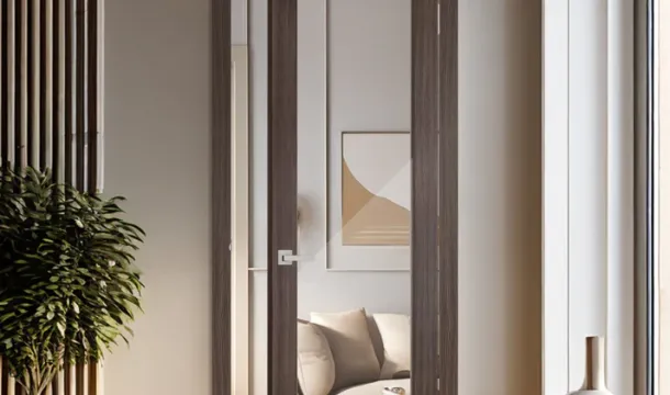
Opt for a subtle blend by selecting door tones that complement the wall palette without overpowering it. For instance, pairing a matte off-white door finish with soft greige walls creates a seamless harmony that enhances natural light and adds warmth.
Introducing contrast through trim can elevate the overall scheme?€"dark-stained wood doors framed by crisp white molding serve as an elegant accent against muted pastel walls. This method balances boldness with refinement, avoiding visual clutter.
Choose shades within the same undertone family to maintain cohesion; cool blues paired with navy or slate doors establish a serene environment, while warm beige walls work well alongside caramel or chestnut finishes on doors and trim. Thoughtful coordination of shade depth ensures neither element dominates the space.
Choosing Door Shades for Walls
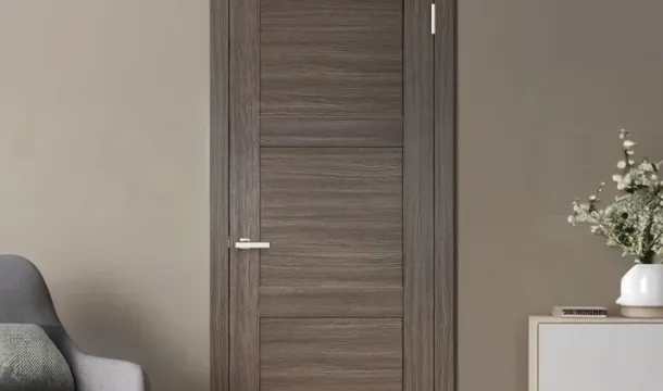
Selecting the right shade for entry panels requires balancing tone and contrast against the surrounding wall surface. Opt for a door tint that either subtly blends with the dominant wall hue or creates deliberate contrast to highlight architectural features. For example, doors painted in a deeper version of the wall?€(TM)s base color establish harmony without becoming monotonous.
Consider the overall palette of the room, including trim and molding finishes. A semi-gloss finish on door surfaces can complement matte or eggshell walls by introducing gentle reflections that add dimensionality. When walls are painted in cool shades like pale blues or greys, warmer wood tones or muted taupes on doors offer an appealing counterpoint within the same scheme.
In spaces where walls sport bold or saturated colors, choosing a neutral door shade?€"such as soft whites, warm grays, or charcoal?€"helps maintain balance while preventing visual overload. Conversely, if walls feature soft pastels or neutrals, richer door hues drawn from accent colors in furnishings or artwork can inject personality without clashing.
The trim around doors acts as a mediator between wall and panel tones; coordinating its shade carefully ensures smooth transitions. For instance, white trims paired with mid-tone door shades soften contrasts and create cohesion within varied palettes.
Lastly, test samples under different lighting conditions before finalizing choices. Natural daylight reveals true undertones, whereas artificial lighting may shift perceived warmth or coolness of both wall coverings and door finishes. This practice guarantees a refined blend that elevates overall spatial appeal.
Contrasting Colors Tips
Select a door finish that creates a deliberate contrast against the wall shade to establish visual interest without overwhelming the palette. For example, pairing a matte deep navy door with soft beige walls introduces an elegant tension that highlights both elements in harmony.
Incorporate accent trim around the doorway in a mid-tone hue from your scheme to soften the stark difference between door and wall. This bridging shade blends the contrast while maintaining clear separation.
When working with bold contrasts, such as a charcoal door on pastel walls, balance the intensity by repeating the darker shade elsewhere?€"like furniture or decor pieces?€"to avoid an isolated focal point.
Use color theory principles: complementary shades on the color wheel (e.g., muted orange doors against blue-gray walls) maximize contrast yet retain cohesion within your overall palette.
Consider texture as part of your contrasting strategy; a glossy door finish can amplify its distinction from flat-painted walls, adding depth without introducing new colors.
Using Neutrals with Doors
Opting for a neutral scheme allows doors to seamlessly blend into the overall ambiance while maintaining subtle sophistication. Selecting a trim shade that shares a similar tone with the walls creates harmony, minimizing harsh contrast and emphasizing a smooth transition between surfaces. For instance, pairing soft greige walls with doors in warm taupe or creamy beige enhances cohesion without monotony.
When introducing accents, consider finishes that add texture rather than bold color shifts?€"matte or eggshell finishes on doors complement satin-painted walls, providing depth through light interaction instead of stark contrast. This approach keeps the space balanced and refined.
Neutrals also offer flexibility in layering different shades within the same palette. A slightly darker door shade compared to the wall tone can act as an understated frame, subtly drawing attention without overpowering other design elements. Incorporating trim in an off-white or muted stone hue further supports this layered effect, creating dimension while preserving a calm atmosphere.
In spaces where minimalism prevails, uniform neutral tones across doors, walls, and trim promote unity and elongate visual lines. Yet introducing subtle variations in shade or finish prevents flatness?€"consider brushed finishes or woodgrain textures on door surfaces to add character while maintaining understated elegance.
Ultimately, neutrals function best when used to balance contrast and accentuate architectural features through thoughtful interplay of tone and finish rather than competing colors. This strategy ensures each element contributes to an integrated aesthetic that feels both timeless and inviting.
Balancing Bold Color Combos
To maintain harmony within a daring scheme, pair a saturated shade on the door with a softer tone on the surrounding walls and trim. This approach prevents overwhelming contrast while allowing each element to serve as a distinct accent.
Consider these strategies to blend intense hues effectively:
- Use mid-tone trims: Select trims in a medium shade that bridges the brightness of the door and the wall?€(TM)s lighter finish, creating a smooth visual transition.
- Incorporate subtle textures: Matte or eggshell finishes on walls can soften bold colors nearby, reducing glare and enhancing cohesion.
- Limit palette complexity: Restrict bold tones to two main components (door and one wall), keeping adjacent surfaces neutral or muted to avoid clashing.
- Introduce complementary accents: Accessories or furnishings echoing either the door?€(TM)s color or wall shade reinforce the scheme?€(TM)s unity without adding new competing tones.
Tone Coordination Techniques
- Analogous pairing: Choose colors next to each other on the color wheel?€"such as deep teal doors with greenish-gray walls?€"to create layered depth without harsh contrast.
- Monochromatic layering: Use varying shades of one hue for door, trim, and walls; for instance, a rich navy door with pale blue walls and medium blue trim maintains interest through tonal shifts rather than stark difference.
Avoiding Visual Overload
- Avoid placing two highly saturated colors directly adjacent without an intermediary shade or finish; this disrupts balance and strains the eye.
- If employing glossy finishes on bold doors, counterbalance with matte or satin walls to prevent excessive shine competing for attention.
- Maintain consistency in undertones?€"warm or cool?€"to ensure all elements align within the same chromatic family, enhancing overall cohesion.