Selecting a dynamic palette that sets the entrance apart from adjacent surfaces immediately elevates spatial interest. Opt for hues positioned on opposite ends of the color wheelsuch as deep navy paired with crisp white wallsto create a striking visual dialogue without overwhelming the room.
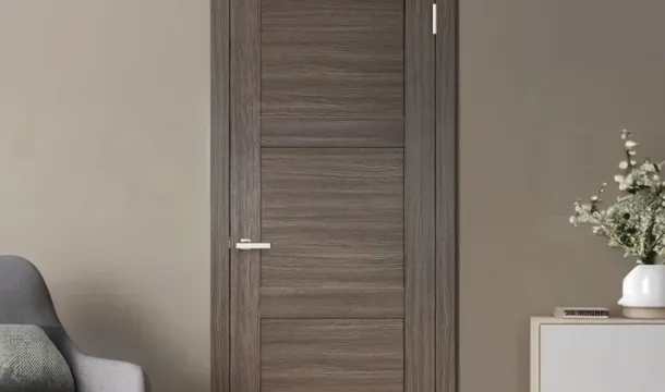
Integrating a saturated shade for door frames against muted or pastel backgrounds enhances architectural features while maintaining balance. For instance, emerald green doors against soft beige tones add warmth and character, especially in Canadian homes embracing natural materials and light-filled interiors.
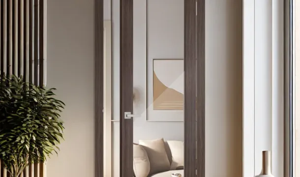
Experimentation with texture can further refine contrast: matte finishes on surrounding walls contrasted with glossy lacquered entry points introduce subtle depth beyond mere pigmentation. Incorporate accent trims or hardware in complementary metals like brushed brass to harmonize the overall palette effectively.
How to Pick Door Colors
Select hues from a palette that complements existing materials and finishes in the room. Prioritize shades that enhance architectural features or highlight unique trim details without overpowering the space. For instance, deep navy or charcoal tones can add sophistication against light hardwood floors, while muted earth tones harmonize well with natural stone or brick elements.
Consider the lighting conditions: cooler shades often work better in rooms with ample natural light, whereas warmer tones help create coziness in dimmer spaces. Testing paint samples on sections of the door under different times of day reveals subtle shifts in undertones and saturation.
Incorporate accent colors found elsewhere in furnishings or decor to establish cohesion. This might mean pulling a rich olive green from upholstery or a burnt orange from decorative accessories into the door's finish. Using a curated palette ensures the entryway feels intentional rather than arbitrary.
Matte or eggshell sheens typically give doors a modern, understated look, while semi-gloss finishes stand up better to frequent use and emphasize clean lines. Match texture choices with surrounding surfaces to maintain visual balancefor example, pairing smooth walls with slightly textured door coatings adds tactility without distraction.
For homes aiming at bold statements, consider unexpected tints like slate blue or terracotta drawn from broader color trends but still grounded by neighboring elements. Contrasting brightness levels within the selected palette also prevents monotonypair lighter walls with saturated door tones or vice versa to anchor spatial flow effectively.
Matching Contrast with Room Style
Aligning the intensity and tone of your palette with the architectural and decorative character of a space enhances cohesion. For minimalist interiors, opt for subtle contrastsmuted shades or monochromatic variations that highlight structural lines without overwhelming simplicity. A matte charcoal door against soft dove-gray walls maintains restraint while offering visual interest.
In traditional settings, richer hues create balance between classic elements and contemporary accents. Deep mahogany or navy entrances paired with warm cream or beige surfaces evoke timelessness and sophistication. Incorporate textured finishes like wood grain or satin to complement ornate moldings and period details.
Eclectic environments invite bolder juxtapositions where unexpected combinations add personality. Vibrant teal doors with terracotta walls energize bohemian layouts; just ensure the chosen palette shares undertones to avoid discordance. Layering complementary patterns in rugs and upholstery can unify disparate elements effectively.
Industrial spaces benefit from high-contrast pairings that emphasize raw materialsblack steel frames set against exposed concrete or whitewashed brick accentuate ruggedness while maintaining clarity. Matte black or oxidized metal tones on openings reinforce the utilitarian aesthetic without compromising warmth.
Scandinavian-inspired rooms thrive on natural contrasts using soft pastels alongside darker neutrals. Powder blue or muted sage entrances framed by off-white walls echo nature's subtle shifts, supporting airy atmospheres. Incorporate wooden trims matching door shades to enhance seamless flow within the palette.
Ultimately, select contrast levels consistent with spatial function and stylistic cues: assertive differences suit dynamic social zones, whereas gentle shifts promote calm in private quarters. Evaluate lighting conditions as wellthe same combination may shift mood dramatically under varying daylight or artificial illumination.
Avoiding Common Color Mistakes
Stick to a well-curated palette that maintains harmony without overwhelming the space. Avoid selecting shades that clash in undertone; for instance, pairing a warm-toned door with a cool-toned wall often creates visual dissonance. Test paint samples side by side under different lighting conditions before finalizing choices.
Steer clear of overly saturated hues that can dominate rather than complement architectural features. Instead, balance bold selections with muted or neutral backgrounds to maintain equilibrium within the room's composition.
Be cautious about using too many contrasting elements simultaneously. Introducing multiple strong tones can fragment the overall aesthetic and reduce cohesion. Limit accent variations to one or two focal points per area.
Ignoring texture and finish differences between surfaces may also lead to unintended effects. Matte walls combined with glossy door finishes can either create appealing depth or undesirable glare depending on color intensityalways evaluate tactile qualities alongside shade decisions.
Lastly, avoid relying solely on trends without considering the existing environment. The chosen palette should resonate with natural light availability, furniture styles, and flooring materials to ensure lasting appeal rather than quick obsolescence.